5 Reasons Your Infographic Sucks
First, let me start out by saying that I am in no way an infographic hater like so many internet marketers these days. I think infographics are an awesome way to showcase data in a non-boring format. That being said, these things are being cranked out so quickly anymore that I feel that many companies aren’t doing enough to make sure their infographics don’t suck. Just because your infographic is pretty, doesn’t mean it should lack quality. After all, if you are trying to build authority in a subject, you should probably put on your best foot forward.
You Didn’t Run the Text Past Your Editors
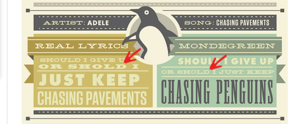
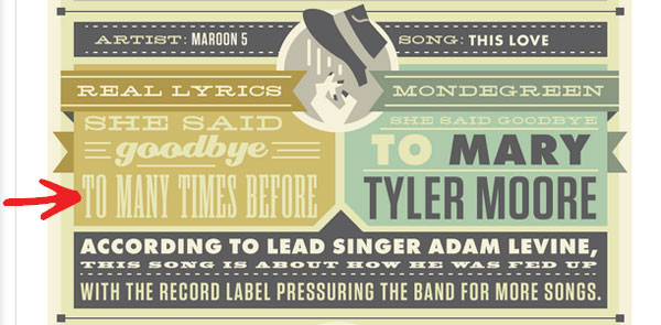
While its probably easy to hide bad grammar, typos, and the like in an infographic they make both your graphic and your company look ridiculous. For instance in an infographic on The Most Commonly Misunderstood Lyrics in Music, and the inspiration for this post I found the following:

Notice both instances of the word “should” are missing the ‘u’ in “should”. If that weren’t enough let’s wrap it up with a grammar less on “to” vs “too”. I’m not sure who Many Times Before is, but I hope he gets a name change.

I Can’t Understand The Data
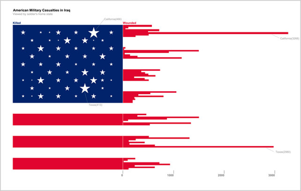
In this moving, yet hard to follow piece featured on FastCompany and created by NYU student Doug Kanter, we see an interesting representation of Iraq soldier casualties through a tattered American flag. However, though the data represents all fifty states, I can really only gather that California and Texas have lost a lot of people to the war and I can’t pinpoint where all the other states start or end.

You Skimped on the ‘Graphic’ Part of Infographic
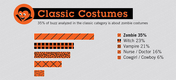
This 2011 graphic featured on Mashable about hot Halloween costumes was a tough one to bash since its one of the few I have seen on Halloween, my favorite holiday, but visually this “graphic” was lacking. The graphics used felt amateur, even for the subject matter. For instance this vampire used makes Count Chocula look like Vlad the Impaler.

I’ll Never Get The Two Minutes It Took To Look At Your Graphic Back
If your subject matter is boring or offers nothing of value, I’m not going to be a happy camper. A great example of this is Lawyers.com’s How To Stay Out of Jail on Super Bowl Sunday graphic. The graphic features five legal hassles to avoid during the Super Bowl, but really these are five common sense things not to get busted for regardless of the Super Bowl.

I Can’t Read It
I’ve come across a number of infographics over the last couple of years that appear to have some great data, but even when scaled to full size I can’t make out some of the text. Make sure your text is legible. This also applies to your layout in general. If it’s too busy and hard to follow it’s not going to resonate well with people. Make sure your graphic isn’t too cluttered or hard to read before it goes out for promotion. To play it safe test it on a variety of resolutions.
Conclusion
Infographics can be a really awesome way to generate links, traffic, and establish yourself as an authority on a subject, but they need to be handled with care. Don’t leave infographics up to your designer to run with. Get all the appropriate parties involved to make sure that your infographic conveys a message that is helping and not hurting your brand or marketing efforts.